Scorecard - Summary
- Chellie Esters
- Caroline Antoun
- Jing Tong (Unlicensed)
- Jason Gauntz (Unlicensed)

This section is for users who log in using www.servicechannel.eu. If you log in using the global instance, www.servicechannel.com, jump over to Network Summary Dashboard.
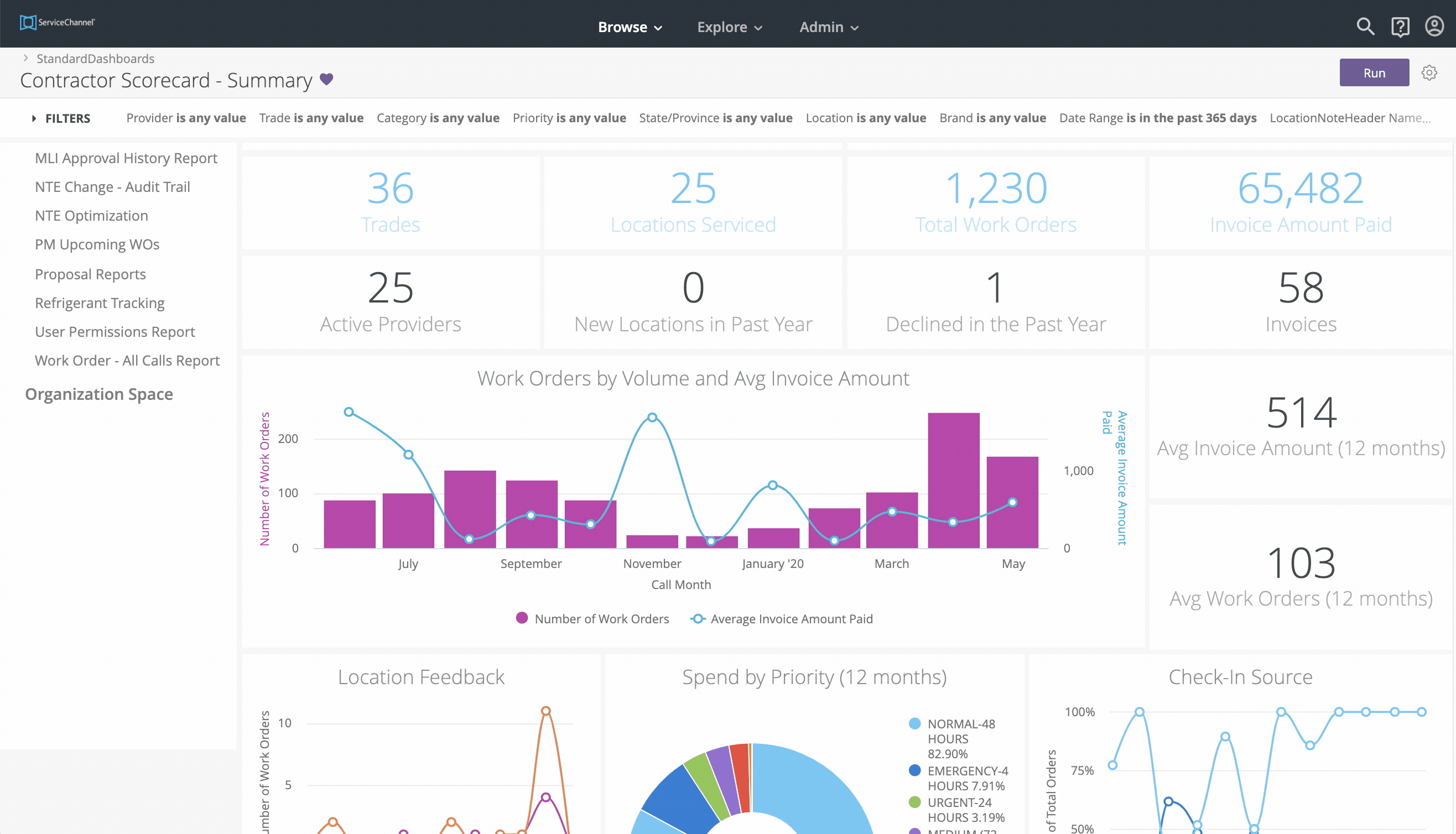
The Summary tab in the Contractor Scorecard dashboard provides a snapshot of your Providers' performance. It summarizes performance scores, repair and maintenance work orders and spend, location feedback, spend by work order priority, and providers' use of the ServiceChannel Provider mobile app for check-in.
There are 4 parts to the Summary:
You can download the data and email reports to recipients.
By default, the Summary shows transactional data for all providers within the past 365 days. Use the all-inclusive filters along the top of the report to view by individual Providers, different date ranges, or other criteria, as needed.
Provider Summary
This section provides an overview of how your contractors are doing with facilities services. Here you can see:
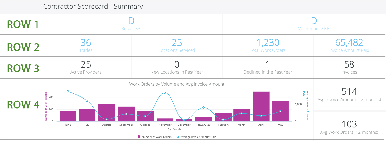
- Row 1: Overall Provider grades for Repair and Maintenance key performance indicators. See Scorecard Score Grade and Calculations for an explanation of calculations.
- Row 2: Number of Trades, Locations Serviced, Total Work Orders, and total Invoice Amount Paid.
- Row 3: Number of Active Providers, number of New Locations that were opened in the Past Year, number of Declined Work Orders in the Past Year, and number of Invoices.
Row 4: Work Orders by Volume visualization, Average Invoice Amount for the past year, and Average number of Work Orders in the past year.
 The Work Orders by Volume and Average Invoice Amount shows monthly trends on facilities spend. Peaks and valleys in this visualization may be indicators of issues happening in your facilities, which could be cause for a deeper analysis. Clicking data points in the graph will show you the underlying data by call date for a deeper analysis.
Location Feedback
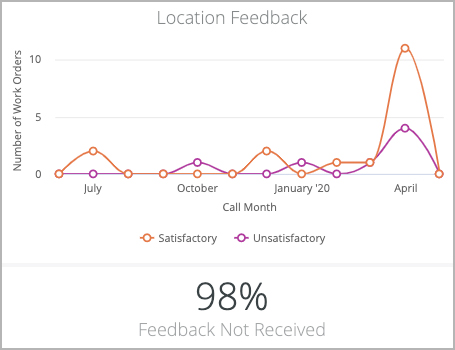
This visualization illustrates the total number of work orders with Satisfactory and Unsatisfactory feedback. Below the chart is the percentage of work orders without location feedback.
Work orders that are auto-confirmed with satisfactory feedback are excluded from this report.
This chart helps you, for example, identify whether your locations are complying with the feedback process, or reviewing the work orders that are not performed to satisfaction. Similar to the Work Order Spend chart, drill down into this visualization see Satisfactory and Unsatisfactory feedback data and work orders.
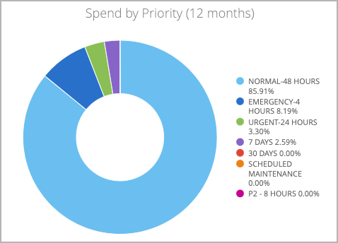
Spend by Priority
This visualization shows the committed spend based on the priority of work orders. A high spend on emergency or high-priority work orders may indicate, for example, a need for a stronger planned maintenance program or an adjustment in your issue list.
Check-In Source
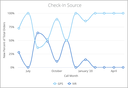
This visualization shows whether providers used the ServiceChannel Provider Mobile App (or GPS) to check into work orders, or whether they used the IVR (telephone) system. This graph provides a discussion point between you and your providers in cases where you are looking for compliance on check-in rules based on your business practices.
We recommend GPS check-in as it is more accurate as it is based on the GPS coordinates of your locations as listed in the Locations module.
You can drill down to view work order details for each check-in source for a specific day.
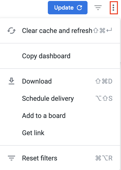
Below is a quick reference guide regarding tracking numbers in Analytics, filtering, sorting, downloading data, and sending reports. Throughout Analytics you can drill down into visualizations to see the underlying data. In most cases, the tracking numbers related to that data are listed. You can click the tracking number to navigate straight to the work order details in Service Automation. On top of the report are all-inclusive filters to help you hone in on key data. All reports on the page are affected by the criteria set in these all-inclusive filters. The filter criteria for each dashboard may differ. Filters reset to the default when the page is refreshed. Click filter field to show the criteria. Select the desired criteria to include or exclude: To Include criteria: select is equal to, contains, starts with, or ends with, and then begin typing the criteria in the picklist. Select the desired criteria (or multiple criteria) from the picklist. To exclude criteria: select is not equal to, does not contain, does not start with, or does not end with. Is null depicts the absence of data in a data set. Conversely, is not null depicts the presence of data To include or exclude data without a certain data criteria — for example, to select data without a Region or District assigned in Service Automation — choose is blank / is not blank. To add more options, click the plus sign (+) next to a field to add another option to the filter. The new option will appear as either an OR condition or an AND condition, depending on the type of filter option. Once all criteria are selected, click Refresh icon in the top-right corner. The Dashboard report updates with the selected criteria. More details are available on Filtering an Analytics Dashboard Analytics tables are dynamic, as you can: In the upper-right corner of any page, click the Vertical Ellipses to download reports, schedule delivery of reports at regular intervals, add to a board, or get a link. You can download data from a table and visualization or download a dashboard tabto PDF or CSV. Select the desired File Format and choose a File Name: A default name is listed but you can change it. On the desired dashboard (or dashboard tab), click the Gear icon in the upper-right of the page, and then click Download as PDF. The Download modal appears. A default Filename appears, but you can change it. Under Advanced options: Single-column format lays out all tables and visualizations on a page into one column in the PDF, as opposed to how it is laid out in the dashboard. Expand tables shows all rows in a table, instead of just the rows that appear on the dashboard. Paper size adjusts the PDF to your desired size. Click Open in Browser to view the PDF in your chosen browser, or click Download to save a version of the report onto your device. On the desired dashboard (or dashboard tab), click the Gear icon in the upper-right of the page, and then click Download as CSVs... A new browser tab opens. After the files render, you are prompted to save the CSV Zip file onto your device. More details are available on Downloading and Sending Dashboards and Reports You can also Send a one-time report via email or Schedule a recurring email send.Commonly Used Features
Tracking Numbers in Analytics
Filtering Dashboards
![]()
Dynamic Table Sorting
Downloading and Sending Reports