Maintenance KPIs Tab
- Chellie Esters
- Caroline Antoun

This section is for users who log in using www.servicechannel.eu. If you log in using the global instance, www.servicechannel.com, jump over to Maintenance KPI Trends Dashboard.
Similar to the Repair KPIs tab, the Maintenance KPI tab shows those indicators that measures performance for your service providers on maintenance work orders in the last 365 days, as well as KPI trends over the past year and KPI performance per location.
On this dashboard you will see:
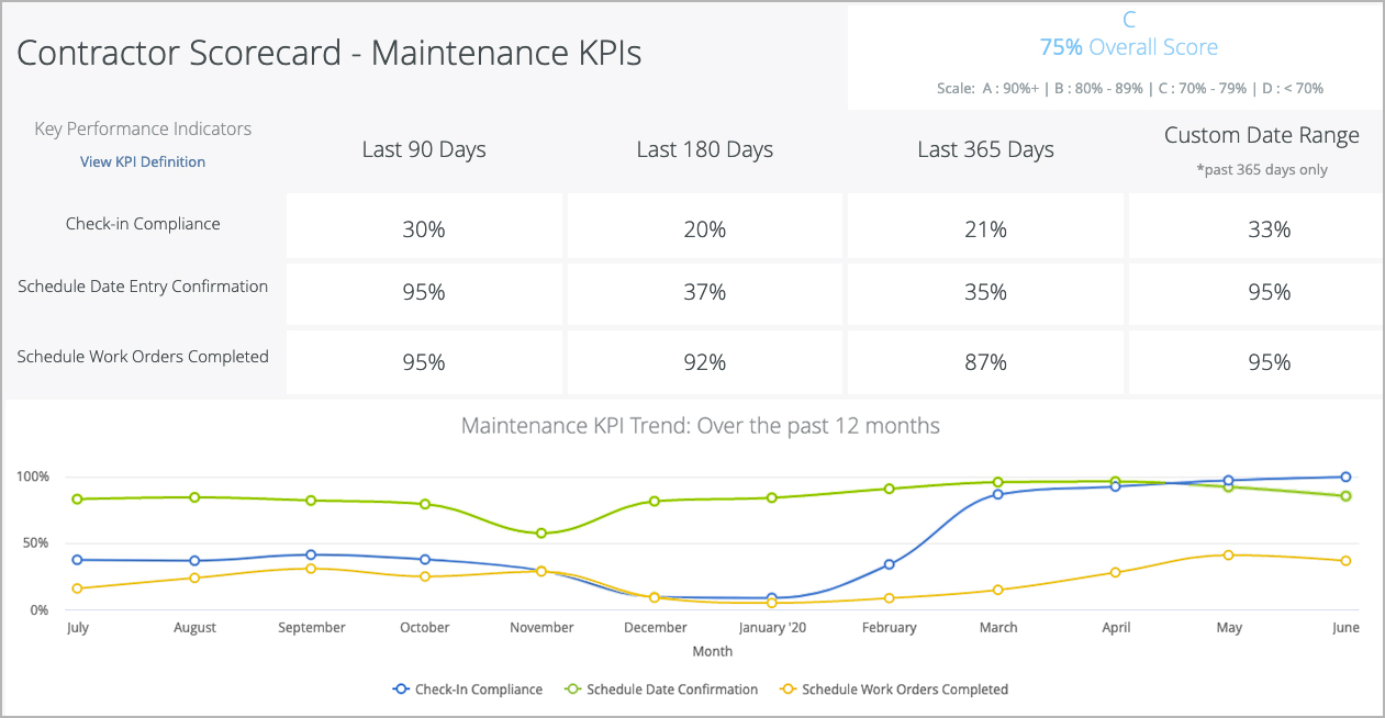
Maintenance Key Performance Indicators
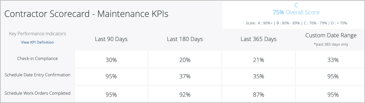
Here, you will see a matrix of Maintenance KPIs and the overall performance of providers over the past 90 days, 180 days, 365 days, or a custom date range under 365 days.
There are 3 Maintenance KPIs:
- Check-in Compliance: the percentage of completed work orders that have both a check-in and a check-out entry, with a minimum check-in time of 10 minutes.
- Schedule Date Entry Confirmation: the percentage of work orders where the scheduled date was updated by the service provider to indicate when the work will be performed (applicable only to Planned Maintenance work orders generated in bulk and with an expiration date).
Scheduled Work Orders Completed: the percentage of work orders that were completed by the service provider before the expiration date of the work order.
Each KPI has a calculated Score, which is the percentage of work orders that meet the criteria for that KPI:
Individual KPI Score (%) = Number of Compliant Work Orders ÷ Total Work Orders
(rounded to the nearest whole number)
In other words, of all the work orders assigned to the Provider, how many work orders did the Provider perform "positive" behavior (for example: checking in and checking out or completing maintenance work orders before the expiration date).
The sum of all KPI Scores gives an Overall Score:
Overall Score = Sum of all KPI scores ÷ Total number of eligible KPIs
The Overall Score is then mapped to a Grade, which represents overall performance.
See Scorecard Maintenance KPIs - Maintenance KPIs Tab for more information on the KPIs, and Calculations for KPI Scores and Overall Grade for more information on KPI scores and overall grades.
Maintenance KPI Trend: Over the Past 12 Months
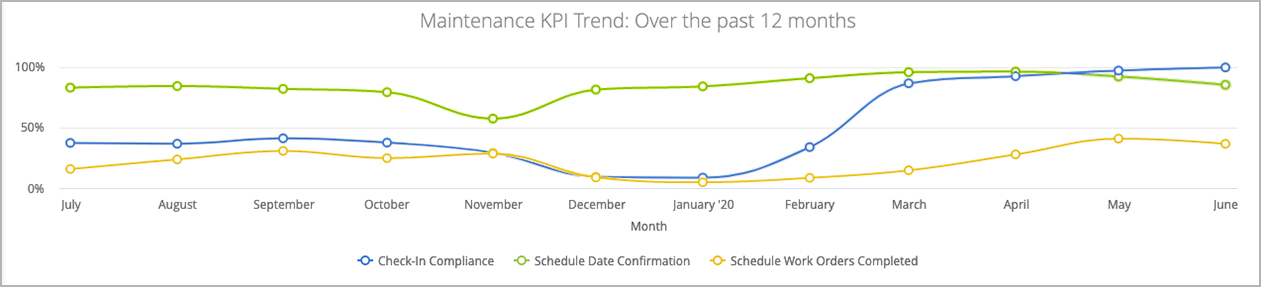
This 12-month trend graphs for the KPIs help identify whether the performance was consistent over the course of the past year. A straight-line graph with a high score indicates a consistent and reliable performance, whereas crests and troughs indicate high and low-performance scenarios. For maintenance work orders, you may also view the trends by quarter.
Hovering your mouse over a data point displays the score for that KPI for the corresponding month. Click a data point to drill down into that month's data.
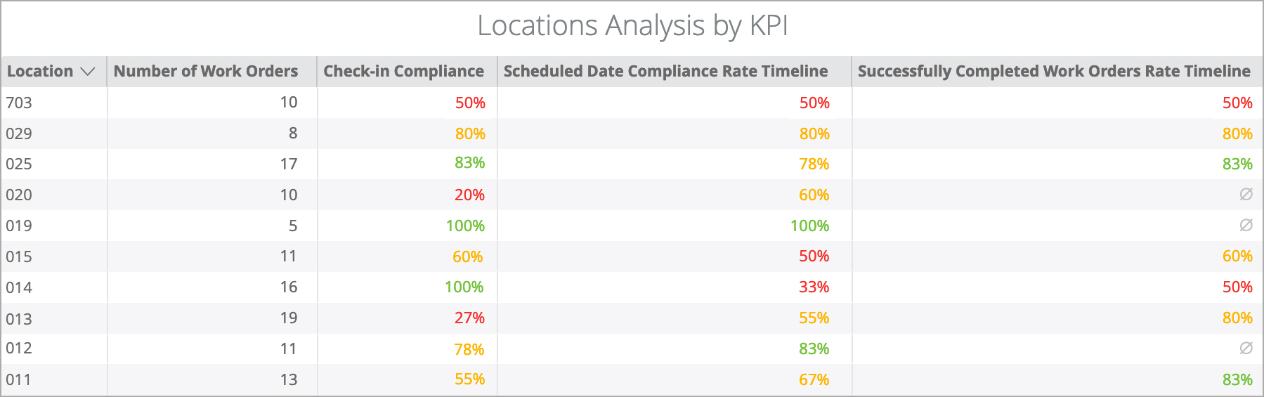
Locations Analysis by KPI
This section displays the score for each KPI by location. Performance levels are colored as follows: <50% red, 50-80% orange, >80% green.
Use this grid to identify locations that have poor performance. This grid also helps you understand why the score for a specific KPI is low - a few locations with low performance may bring the overall score for all locations down for a KPI.
Commonly Used Features
Below is a quick reference guide regarding tracking numbers in Analytics, filtering, sorting, downloading data, and sending reports.
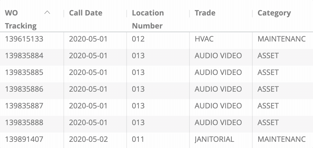
Tracking Numbers in Analytics
Throughout Analytics you can drill down into visualizations to see the underlying data. In most cases, the tracking numbers related to that data are listed. You can click the tracking number to navigate straight to the work order details in Service Automation.
Filtering Dashboards
On top of the report are all-inclusive filters to help you hone in on key data. All reports on the page are affected by the criteria set in these all-inclusive filters.
The filter criteria for each dashboard may differ. Filters reset to the default when the page is refreshed.
Click filter field to show the criteria.

Select the desired criteria to include or exclude:
To Include criteria: select is equal to, contains, starts with, or ends with, and then begin typing the criteria in the picklist. Select the desired criteria (or multiple criteria) from the picklist.
To exclude criteria: select is not equal to, does not contain, does not start with, or does not end with.
Is null depicts the absence of data in a data set. Conversely, is not null depicts the presence of data
To include or exclude data without a certain data criteria — for example, to select data without a Region or District assigned in Service Automation — choose is blank / is not blank.
To add more options, click the plus sign (+) next to a field to add another option to the filter. The new option will appear as either an OR condition or an AND condition, depending on the type of filter option.
Once all criteria are selected, click Refresh icon in the top-right corner. The Dashboard report updates with the selected criteria.
More details are available on Filtering an Analytics Dashboard
Dynamic Table Sorting
Analytics tables are dynamic, as you can:
- click column and row headers to sort data (the arrow indicate which data is sorted),
- hover over a header to show the gear icon where you can interact with the data more dynamically, and
- drag and drop a header to rearrange the table.
Downloading and Sending Reports
In the upper-right corner of any page, click the Vertical Ellipses to download reports, schedule delivery of reports at regular intervals, add to a board, or get a link.
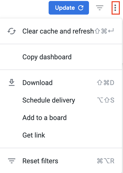
You can download data from a table and visualization or download a dashboard tabto PDF or CSV.
- On the desired table or visualization, hover over the upper-right to expose the 3 dots menu, and then click Download Data. The Download modal appears.

Select the desired File Format and choose a File Name: A default name is listed but you can change it.
- Click Download.
On the desired dashboard (or dashboard tab), click the Gear icon in the upper-right of the page, and then click Download as PDF. The Download modal appears.
A default Filename appears, but you can change it.
Under Advanced options:
Single-column format lays out all tables and visualizations on a page into one column in the PDF, as opposed to how it is laid out in the dashboard.
Expand tables shows all rows in a table, instead of just the rows that appear on the dashboard.
Paper size adjusts the PDF to your desired size.
Click Open in Browser to view the PDF in your chosen browser, or click Download to save a version of the report onto your device.
On the desired dashboard (or dashboard tab), click the Gear icon in the upper-right of the page, and then click Download as CSVs... A new browser tab opens.
After the files render, you are prompted to save the CSV Zip file onto your device.
More details are available on Downloading and Sending Dashboards and Reports
You can also Send a one-time report via email or Schedule a recurring email send.