Condition Analysis Tab
- Chellie Esters
- Caroline Antoun
- AJ Steele
This Condition Analysis Tab displays warranty, age, condition, and repair/replace analysis of assets. Here, you can view all asset-related work orders for the past 365 days (by default) or by the criteria set in the all-inclusive filters along the top of the report.
You can download the data and email reports to recipients.
Visualizations in this Dashboard
There are two sections, with visualizations under each:
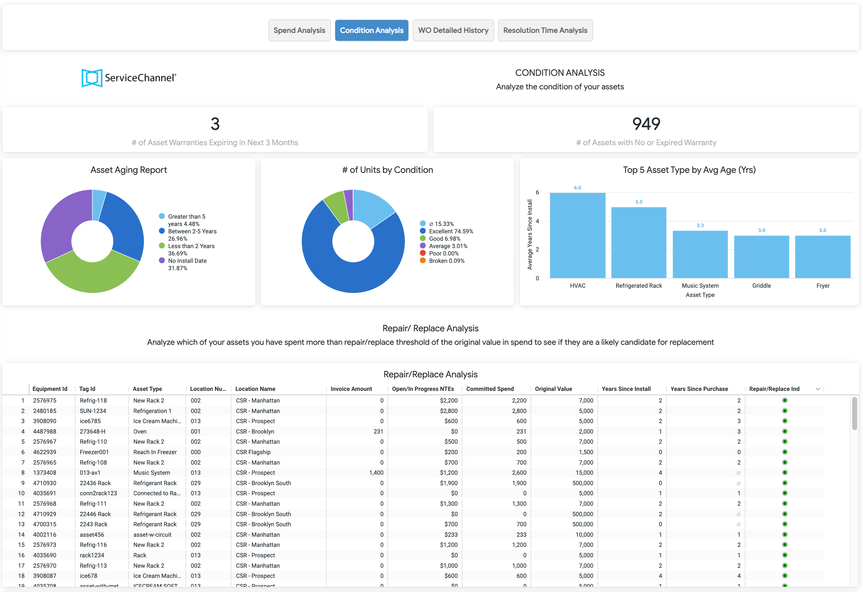
Condition Analysis gives a headline view of warranty summary, asset aging, units by condition, and the top five assets by average age.
Repair/Replace Analysis breaks down whether an asset may need to be repaired or replaced in the near future.
Condition Analysis
Asset Warranty Summary
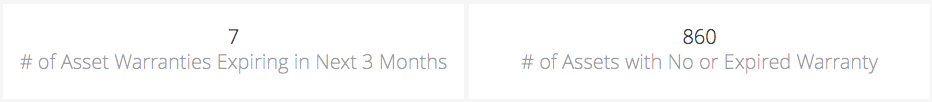
These headline tiles display assets with warranties that expire in the next 3 months and assets with no or expired warranty. The summary is based on the warranty date entered into the asset module on Service Automation. Here you will find:
- The number of Asset warranties expiring in the new 3 months
- The number of Assets with no or expired warranty
Click into each visualization to view the underlying data, such as tag ID, condition, number of work orders with expiring or no or expired warranties.
Asset Aging Report
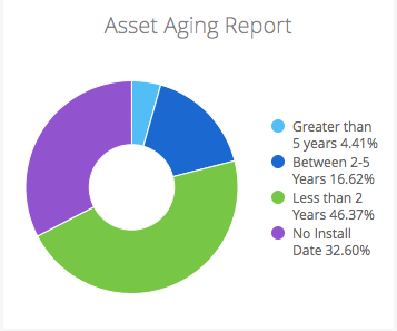
This visualization groups assets into four buckets. Assets Greater than 5 Years, Between 2-5 Years, Less than 2 Years and No Install Date. All buckets assets fall under are based on the Install Date entered (or left blank for no install date) into the asset module on Service Automation.
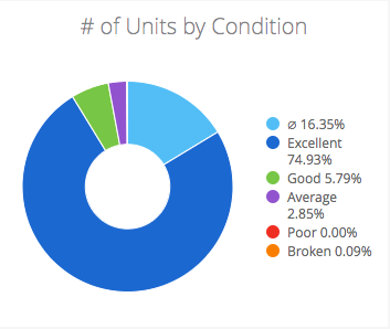
Number of Units by Condition
This visualization groups assets into five buckets. Assets are in Excellent, Good, Average, Poor or Broken condition. All buckets assets fall under are based on the Condition entered into the asset module on Service Automation.
Null values will appear if the condition is left blank in the asset module.
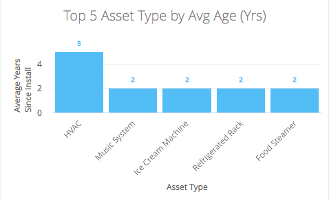
Top 5 Asset Type by Average Age (Years)
This visualization displays the top 5 asset types by average age. Average years are based on the install dates entered in the asset module.
Repair/Replace Analysis
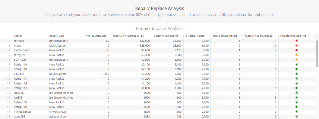
This report helps analyze assets in which the spend is greater than 80% of the original value in spend, to see if they are candidates for replacement.
The following data is listed in the report, sortable by these column headers:
- Tag ID
- Asset Type
- Invoice Amount
- Open/In Progress NTEs
- Committed Spend: calculates the total of the invoice amount for work orders that have an approved invoice amount, plus the NTE amount for work orders that do not have an approved invoice
- Original Value
- Years Since Install
- Years Since Purchase
Repair/Replace Ind: Green indicates committed spend less than 70% of the original value of the asset, Orange indicates committed spend less than 80% of the original value of the asset, and Red indicates committed spend greater than 80% of the original value of the asset.
Null values will appear if the Original Value was left blank in asset manager.
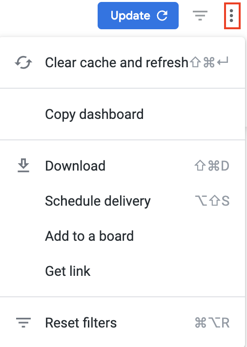
Below is a quick reference guide regarding tracking numbers in Analytics, filtering, sorting, downloading data, and sending reports. Throughout Analytics you can drill down into visualizations to see the underlying data. In most cases, the tracking numbers related to that data are listed. You can click the tracking number to navigate straight to the work order details in Service Automation. On top of the report are all-inclusive filters to help you hone in on key data. All reports on the page are affected by the criteria set in these all-inclusive filters. The filter criteria for each dashboard may differ. Filters reset to the default when the page is refreshed. Click filter field to show the criteria. Select the desired criteria to include or exclude: To Include criteria: select is equal to, contains, starts with, or ends with, and then begin typing the criteria in the picklist. Select the desired criteria (or multiple criteria) from the picklist. To exclude criteria: select is not equal to, does not contain, does not start with, or does not end with. Is null depicts the absence of data in a data set. Conversely, is not null depicts the presence of data To include or exclude data without a certain data criteria — for example, to select data without a Region or District assigned in Service Automation — choose is blank / is not blank. To add more options, click the plus sign (+) next to a field to add another option to the filter. The new option will appear as either an OR condition or an AND condition, depending on the type of filter option. Once all criteria are selected, click Refresh icon in the top-right corner. The Dashboard report updates with the selected criteria. More details are available on Filtering an Analytics Dashboard Analytics tables are dynamic, as you can: In the upper-right corner of any page, click the Vertical Ellipses to download reports, schedule delivery of reports at regular intervals, add to a board, or get a link. You can download data from a table and visualization or download a dashboard tabto PDF or CSV. Select the desired File Format and choose a File Name: A default name is listed but you can change it. On the desired dashboard (or dashboard tab), click the Gear icon in the upper-right of the page, and then click Download as PDF. The Download modal appears. A default Filename appears, but you can change it. Under Advanced options: Single-column format lays out all tables and visualizations on a page into one column in the PDF, as opposed to how it is laid out in the dashboard. Expand tables shows all rows in a table, instead of just the rows that appear on the dashboard. Paper size adjusts the PDF to your desired size. Click Open in Browser to view the PDF in your chosen browser, or click Download to save a version of the report onto your device. On the desired dashboard (or dashboard tab), click the Gear icon in the upper-right of the page, and then click Download as CSVs... A new browser tab opens. After the files render, you are prompted to save the CSV Zip file onto your device. More details are available on Downloading and Sending Dashboards and Reports You can also Send a one-time report via email or Schedule a recurring email send.Commonly Used Features
Tracking Numbers in Analytics
Filtering Dashboards
![]()
Dynamic Table Sorting
Downloading and Sending Reports