Decision Engine Invoice Insights
- Jing Tong (Unlicensed)
- Anastasiya Dashuk (Unlicensed)
Decision Engine Insights gives you a consolidated view of exceptions in your invoices and allows you to identify auto-approval trends by analyzing the corresponding charts.
You should have the Decision Engine User secondary role to access Decision Engine Insights.
- Go to the Invoices List, and switch to the Insights tab.

Overview of the Insights Tab
Below is an overview of the Insights tab.

- Auto-Approval Rules Last Updated. In the upper-left corner of the tab, you can see when your auto-approval rules were last updated. Learn more about configuring auto-approval rules for invoices. Note that this feature is not available to subscribers who have a customized auto-approval process.

- Filter Within. In the drop-down list at the top of the tab, select the desired time period for which data is plotted on the charts — the last 1, 3, or 6 months.

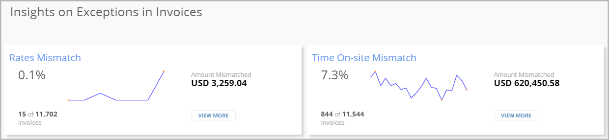
- Insights on Exceptions in Invoices. Charts that provide a consolidated view of exceptions in your invoices.
The chart on the left shows data on invoices with mismatched rates, where the specified rates don’t match the rates you have agreed upon with the providers. Learn more about approving and rejecting the rates proposed by a provider.

- The chart on the right contains info on invoices with mismatched time spent on-site. Use this chart to view statistics on invoices where the time that providers actually spent on-site does not match the time they reported.
- Auto-Approval Trends. Charts that illustrate trends in auto-approving invoices via Decision Engine based on your auto-approval rules.
- The chart on the left combines two data sets aggregated by month:
- The blue bar chart shows the percentage of auto-approved invoices.
The orange line chart displays the average amount of auto-approved invoices.
Hover over the graph for the desired month to view info on auto-approved invoices in tooltips.

The chart on the right is a scatter plot showing the amount distribution for auto-approved invoices. The position of green dots indicates when the invoice was auto-approved and what was the invoice amount.
Hover over a dot to view when a specific invoice was auto-approved as well as the invoice amount and number in a tooltip.

- The chart on the left combines two data sets aggregated by month:
Viewing Insights on Exceptions in Invoices
At the top of the Insights tab, you can view charts representing data on exceptions in invoices. An exception is triggered when there is a mismatch in rates or time spent on-site in an invoice.
In the overlay showing the top 5 providers and locations, hover over a bar to view the number of invoices as well as the provider name or location ID.

To navigate to configuring auto-approval rules for invoices, click Create Auto Approval Rule. This option is not available to subscribers who have a customized auto-approval process.
Tips for Working with Charts
Below are tips for working with charts showing auto-approval trends. Note that many of these tips are also applicable to the Rates Mismatch and Time On-Site Mismatch overlays showing the top 5 providers and locations with exceptions.

Expanding a Chart
To expand a chart, click Zoom-In in the lower-left corner of the chart. The chart expands to fill the entire width of the Insights tab, while other charts become hidden. To collapse the chart, click Zoom-Out in the lower-left corner.

Moving the Graph
You can move the graph vertically and horizontally to focus on specific pieces of data.
- Click the horizontal axis of the chart, and drag it left or right.
- Click the vertical axis of the chart, and drag it up or down.
You can move the vertical axes of the Percentage of Invoices Auto Approved chart independently of each other.
To restore the axis position, double-click the corresponding axis.
Scaling the Graph
You can scale the graphs vertically or horizontally.
- To scale the graph horizontally, move the pointer to the left or right side of the horizontal axis. When the pointer becomes a double-headed horizontal arrow, click the axis, and drag it either left or right depending on whether you want to stretch or compress the graph.
- To scale the graph vertically, move the pointer to the top or bottom of the vertical axis. When the pointer becomes a double-headed vertical arrow, click the axis, and drag it either up or down depending on whether you want to stretch or compress the graph.
You can scale both plots of the Percentage of Invoices Auto Approved chart independently of each other.
- To scale the graph both horizontally and vertically, move the pointer to any corner of the chart. The pointer turns into a double-headed arrow. Click the chart, and move the pointer in the direction you need to scale the graph.
To go back to the default scaling, double-click the corresponding axis.
Zooming in on an Area
To zoom in on a specific chart area, draw a rectangle using the cross-shaped pointer. Once you move the pointer on the graph, it turns into a cross.
Restoring the Default View
To return to the default chart view, double-click in the chart area.