Provider Cost Comparison Dashboard
- Caroline Antoun
The Provider Cost Comparison dashboard is a tool to compare individual providers within your network to the baseline of your total network’s median costs. Using this dashboard, you can filter to a trade in question and investigate whether or not certain providers are driving that cost change. This dashboard is often used in companion with the Year-Over-Year Cost Comparison dashboard.

Navigation
You can find this dashboard under the SC Pilot Dashboards folder in Analytics.
This Dashboard is broken up into 2 Sections:
- Filters
- Looks
Filters

Looks
Work Orders that have 10 or more in the selected invoice period will show up on the Baseline Cost by Trade look and the Provider Cost Comparison Look.
- Baseline Cost by Trade: View a baseline Invoice Amount Approved, Median Invoice, Labor, and Material Amounts for individual trade. This is helpful to identify where provider costs fall alongside the overall trade costs.
- Provider Cost Comparison Look: Compare the WO Count, total Approved Invoice Amount, and Median Invoice/Labor/Material amounts between providers within a trade and against the trade’s baseline amounts to understand the wider impact of provider cost differences.
- Ex: We filter into the HVAC trade and we can see the total WO count for HVAC is 726, the Median Invoice Amount is $534 broken down to $415 for Median Labor Amount and $187 for Median Material Amount. If we look at our providers, most of them stay within the median amounts. The outlier we have here is BOBBIE HVAC TWO. This data warrants drilling in further to see why costs are higher with this provider.

Commonly Used Features
Below is a quick reference guide regarding tracking numbers in Analytics, filtering, sorting, downloading data, and sending reports.
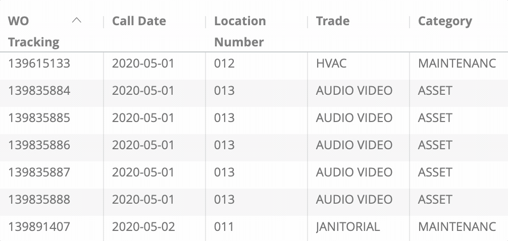
Tracking Numbers in Analytics
Throughout Analytics you can drill down into visualizations to see the underlying data. In most cases, the tracking numbers related to that data are listed. You can click the tracking number to navigate straight to the work order details in Service Automation.
Filtering Dashboards
On top of the report are all-inclusive filters to help you hone in on key data. All reports on the page are affected by the criteria set in these all-inclusive filters.
The filter criteria for each dashboard may differ. Filters reset to the default when the page is refreshed.
Click filter field to show the criteria.

Select the desired criteria to include or exclude:
To Include criteria: select is equal to, contains, starts with, or ends with, and then begin typing the criteria in the picklist. Select the desired criteria (or multiple criteria) from the picklist.
To exclude criteria: select is not equal to, does not contain, does not start with, or does not end with.
Is null depicts the absence of data in a data set. Conversely, is not null depicts the presence of data
To include or exclude data without a certain data criteria — for example, to select data without a Region or District assigned in Service Automation — choose is blank / is not blank.
To add more options, click the plus sign (+) next to a field to add another option to the filter. The new option will appear as either an OR condition or an AND condition, depending on the type of filter option.
Once all criteria are selected, click Refresh icon in the top-right corner. The Dashboard report updates with the selected criteria.
More details are available on Filtering an Analytics Dashboard
Dynamic Table Sorting
Analytics tables are dynamic, as you can:
- click column and row headers to sort data (the arrow indicate which data is sorted),
- hover over a header to show the gear icon where you can interact with the data more dynamically, and
- drag and drop a header to rearrange the table.
Downloading and Sending Reports
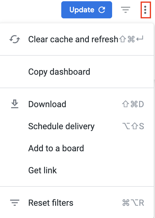
In the upper-right corner of any page, click the Vertical Ellipses to download reports, schedule delivery of reports at regular intervals, add to a board, or get a link.
You can download data from a table and visualization or download a dashboard tabto PDF or CSV.
- On the desired table or visualization, hover over the upper-right to expose the 3 dots menu, and then click Download Data. The Download modal appears.

Select the desired File Format and choose a File Name: A default name is listed but you can change it.
- Click Download.
On the desired dashboard (or dashboard tab), click the Gear icon in the upper-right of the page, and then click Download as PDF. The Download modal appears.
A default Filename appears, but you can change it.
Under Advanced options:
Single-column format lays out all tables and visualizations on a page into one column in the PDF, as opposed to how it is laid out in the dashboard.
Expand tables shows all rows in a table, instead of just the rows that appear on the dashboard.
Paper size adjusts the PDF to your desired size.
Click Open in Browser to view the PDF in your chosen browser, or click Download to save a version of the report onto your device.
On the desired dashboard (or dashboard tab), click the Gear icon in the upper-right of the page, and then click Download as CSVs... A new browser tab opens.
After the files render, you are prompted to save the CSV Zip file onto your device.
More details are available on Downloading and Sending Dashboards and Reports
You can also Send a one-time report via email or Schedule a recurring email send.
Filter by label
There are no items with the selected labels at this time.