Premium Analytics (Explore)
- Chellie Esters
In addition to the ServiceChannel Standard Dashboards, Premium Analytics gives you the data to tell the story of your facilities operations. Users with Pro access in Service Automation Permissions have access to create custom visualizations and dashboards using hundreds of data points including (but not limited to):
- your data from your work orders, such as tracking numbers, work order details, assets, invoices, proposals, NTEs;
- your configuration, such as priorities, categories, districts/regions, statuses, location information, users;
- your providers, both internal and external, along with check-in data, time onsite, performance, and many other data points.
Accessing Premium Analytics
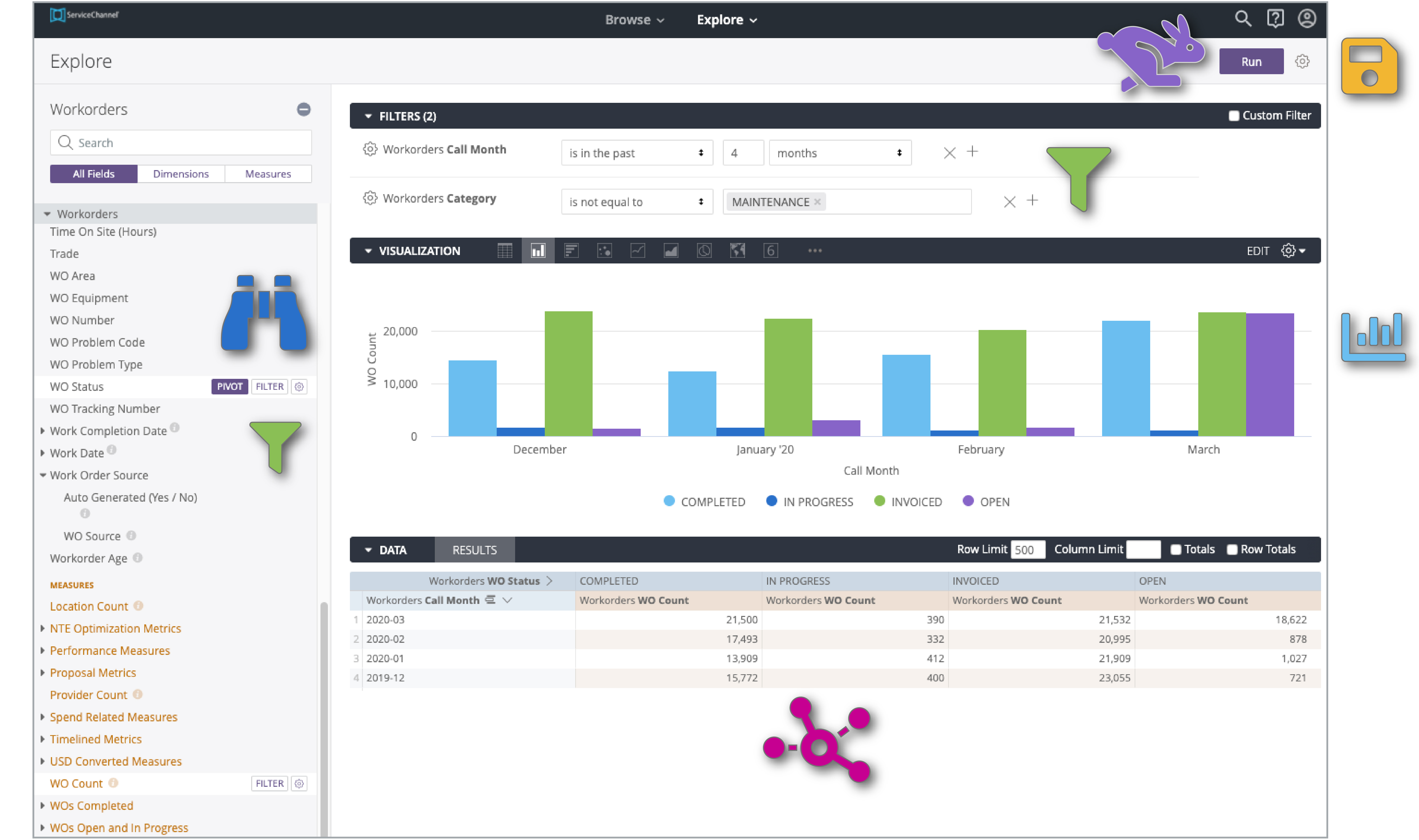
Permissioned users will see Explore in the top menu bar.
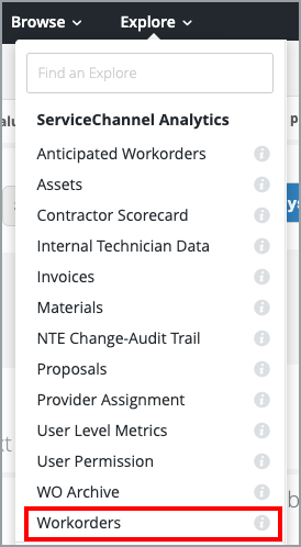
- From anywhere in Analytics, click Explore in the top bar. The list of ServiceChannel Analytics Explores appear, where you can query data from fields needed to build your visualizations.
Click the desired Explore (for example, Workorders). You will navigate to the visualization build area. See Navigating the Visualization Build Area, below.
As Subscriber data differs, the full list of Explores may vary from what is shown above.
Why is the Workorders Explore Recommended?
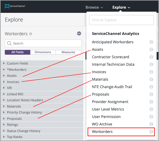
The Workorders Explore has most of the data fields you would typically need to build a visualization, as illustrated below.
The other Explores — such as NTE Change-Audit Trail or User Level Metrics — are topic-specific and limited in both data fields and scope.
We recommend working with Workorders for your first visualization builds.
Navigating the Visualization Build Area
Before going into building custom visualizations, let us walk through the interface to help you become familiar.
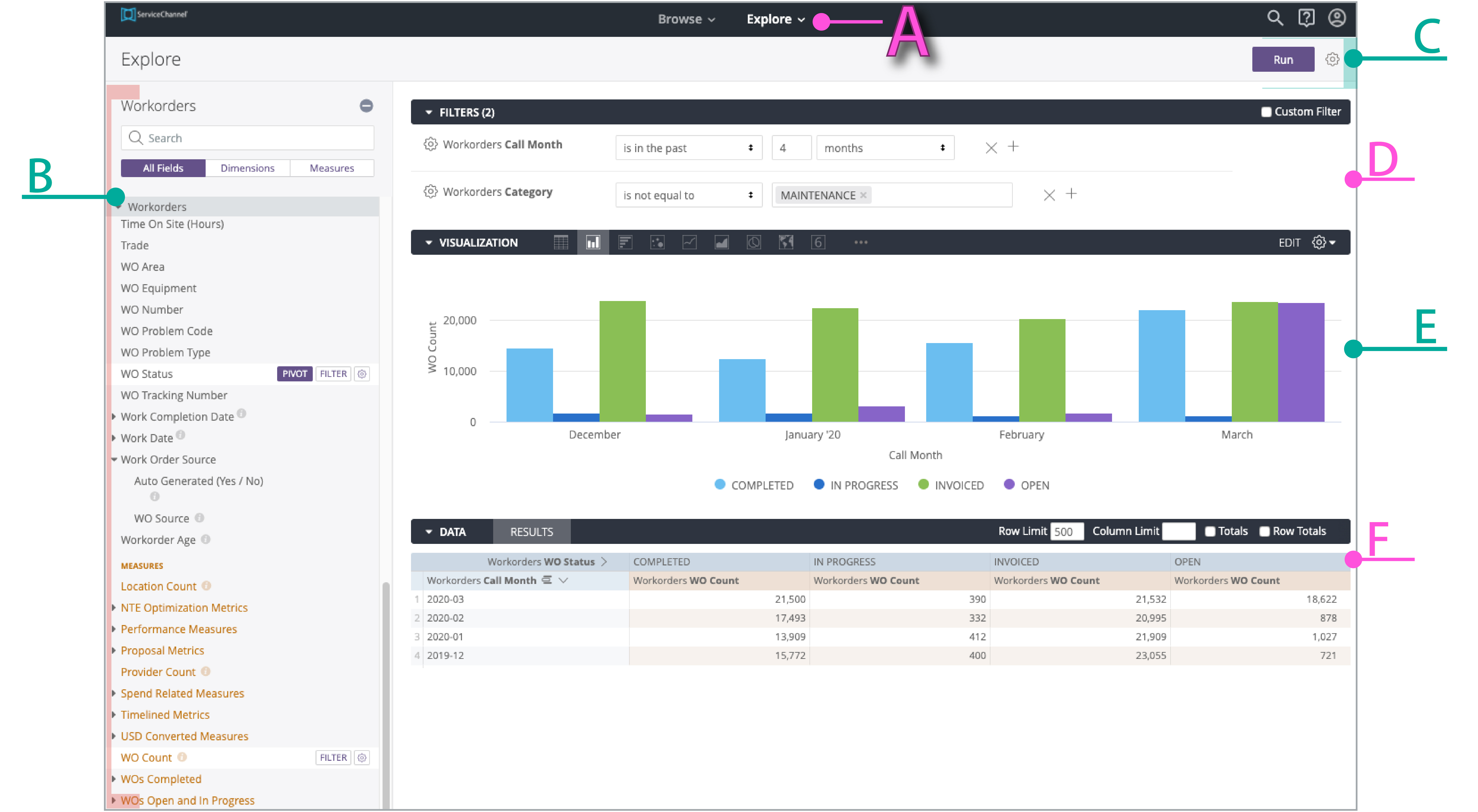
Section A: Explore Menu. From anywhere in Analytics, click the Explore menu to navigate to the visualization build area.
Section B: Data Fields. Here, you will choose the data points to help you create your custom visualizations. This is the key to all visualizations. See Selecting Dimensions and Measures from the Data Field Picker for more information.
Section C: Run / Gear. After selecting your data and filters, click Run to see the visualization (Section E). Once you are pleased with the visualization, click the Gear icon to save your visualization to a custom Dashboard or Look.
Section D: Filters and Pivots. While manipulating your data (Section F), select the data from which to filter and pivot (from Section B) to hone into the data points you want to display in your visualization.
- Section E: Visualization Area. When you Run data (Section C), you will see your visualization appear in this area. There are many types of charts and graphs to help you tell your data story.
Section F: Data. As you select data from the Data FIelds Picker area (Section B), it will appear here.
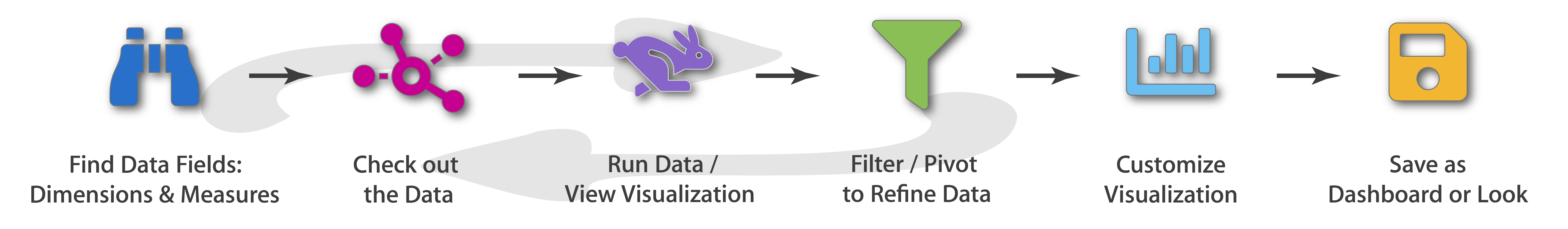
Thinking of the Visualization Build Area as a Workflow
Many sections in the visualization build area, indeed! Another way to think of this is in a step-by-step workflow:
Viewing the Explore as a Workflow: An Example
Once you figure out the story you want to tell in your visualization, use the Explore to help you build that story.
- Select the appropriate data fields.
- Review and refine the data.
- Run the data to see the first-draft visualization.
- Apply and refine filters and pivots.
- You may have to cycle between the data and the filters/pivots until you get what you want. Every time, click Run to see the updated visualization.
- Customize your final visualization with various layout options.
- Save the visualization on a Dashboard or as a separate Look.
Let's take a closer look at each section. First up:
- Selecting Dimensions and Measures from the Data Field Picker
- Checking the Data for a Visualization in an Explore
- Running the Data and Viewing the Visualization
- Filtering and Pivoting Data
- Creating Table Calculations as Custom Data Fields
- Customizing Visualizations
- Saving Dashboards and Looks
- Sharing Dashboards

Filter by label
There are no items with the selected labels at this time.