- Created by Caroline Antoun , last modified on Oct 20, 2021
You are viewing an old version of this page. View the current version.
Compare with Current View Page History
« Previous Version 24 Next »
Benchmarking Dashboards give you an independent and confidential perspective on how you compare to your peers based on various metrics. See where you might be spending too much and are not as efficient or even better, see exactly which areas you are you rocking it, resulting in longer uptime and incredible customer experiences. You can find these dashboards in the ServiceChannel Benchmarking Dashboards folder under Organization Space.

Benchmarking data is refreshed on the second Sunday of every month. If you are new to ServiceChannel (welcome!), your benchmarking data will appear once you have 100 paid / approved invoices in ServiceChannel. Some metrics will not show up until you have a certain amount of those invoice types. For example, trade specific information will not show up until you have 30 invoices of that specific trade. You will see data from the last year (rolling): spend data is based on invoice date and work order, and efficiency data is based on work order call date.
The following Benchmarking Dashboards are available:
Benchmarking - Summary: is an aggregate of spend across all trades and compares you against your peers.
Benchmarking - Primary Trade: drills down further and compares you to your peers at the trade level.
Benchmarking Data
Filters
When you first open the dashboards, you will be compared to everyone in ServiceChannel. To gather more meaningful data, compare yourself to your peers by choosing from the following filters:
- Portfolio Size
- Annual Spend per Location
- Industry
- Industry Sector
- Primary Trade (Benchmarking - Primary Trade dashboard only)
Filters are defined below in terms of range / options. When selecting certain filters, there will only be one option available to you: your company definition or everyone in ServiceChannel. For example, if you are a small company, you are in the 50 or less category, and can filter against other 50 or less companies. If you do not select anything for this filter, you will leave this category open to all portfolio sizes.
| Filter Name | Range & Options |
|---|---|
| Portfolio Size |
|
| Annual Spend per Location |
|
| Industry |
|
| Industry Sector |
|
| Primary Trade (Benchmarking - Primary Trade Dashboard only) |
|
Note
For data to appear using the selected filters, there must be 5 or more peers in that data set to protect privacy. Otherwise, you will get the message too few peers in the place of data.
Metrics
Spend, Work Order Volume, and Efficiency are the benchmark metrics that determine performance.
Spend
- Annual spend per location
- Average invoice amount
- Maintenance spend %
- Repair spend %
Work order volume
- Annual Work Orders per Location
- % of Work Orders with Proposals
Efficiency
- Median Work Order Resolution Time
- Median Time Waiting for Parts
- Median Time for Proposal Submission
- Median Time to Approve Proposals
Data Presentation
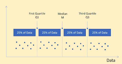
The pool of data is divided into four equal groupings and based on the median in order not to skew data with outliers. The 1st and 3rd quartile are presented in the charts.

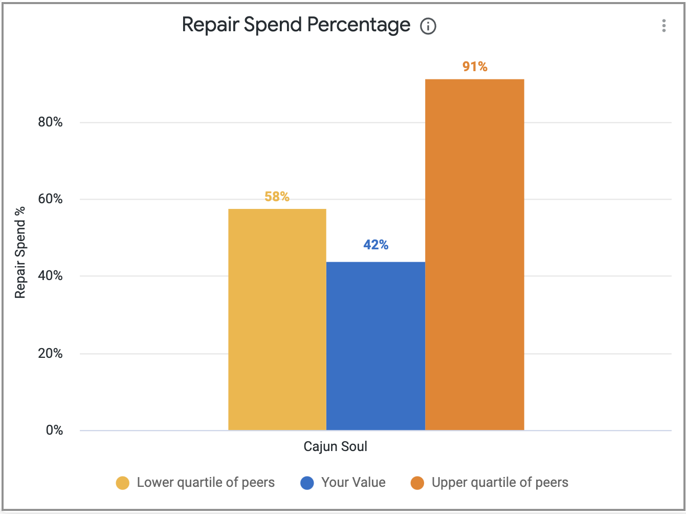
Each visualization is shown in order of Lower Quartile (yellow bar is Q1), Your Value (blue bar is your data), and the Upper Quartile (orange bar is Q3).

-
Page:
-
Page:
-
Page:
-
Page:
-
Page:
-
Page:
-
Page:
-
Page:
- No labels
