The Benchmarking - Summary Dashboard is an aggregate of spend and efficiency KPIs across all trades and compares your facility management program against your peers. This independent perspective enables you to identify areas where you might be spending more than your peers or spending less and could actually justify a larger budget if it enhances facility performance. If there are less than 5 peers in your filtered data set, you will see the message too few peers. 
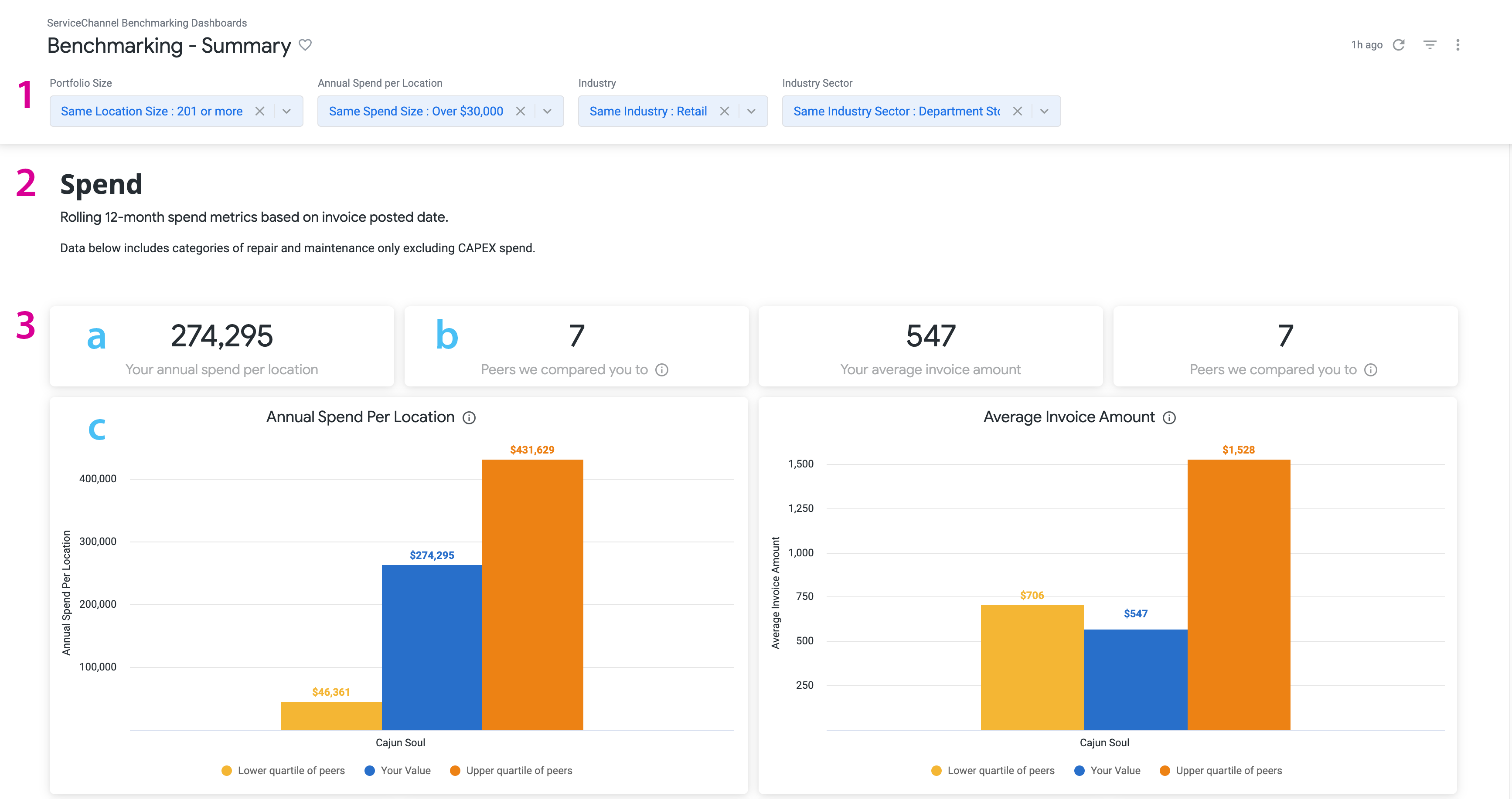

Sections in this dashboard are:

  1. Filters 

  2. Metrics 

  3. Data Visualization
    1. Number presentation of metric 

    2. Total number of peers benchmarked against 

    3. Bar chart visualization 

Data is updated on the 2nd Sunday of each month. You can download the data for each visualization and email reports to recipients.


Data Visualization

Spend

Metrics used in this section are based on the invoice date from the last rolling 12 months.


Should you have less than 12 months of data, this visualization will not be an "apples-to-apples" comparison when viewed against peers.


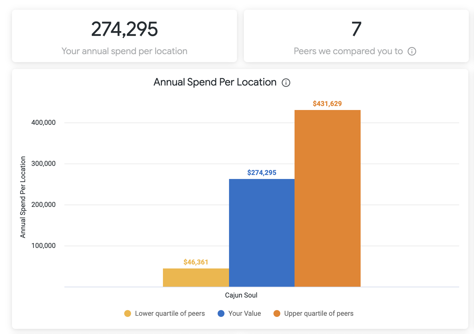
Annual Spend per Location

Shows how your average annual spend per location compares to your peer group. Easily see where your spend is higher / lower than the upper quartile and make informed decisions on whether you need to narrow in on why spend is significantly higher or can justify adding more to your facilities budget.


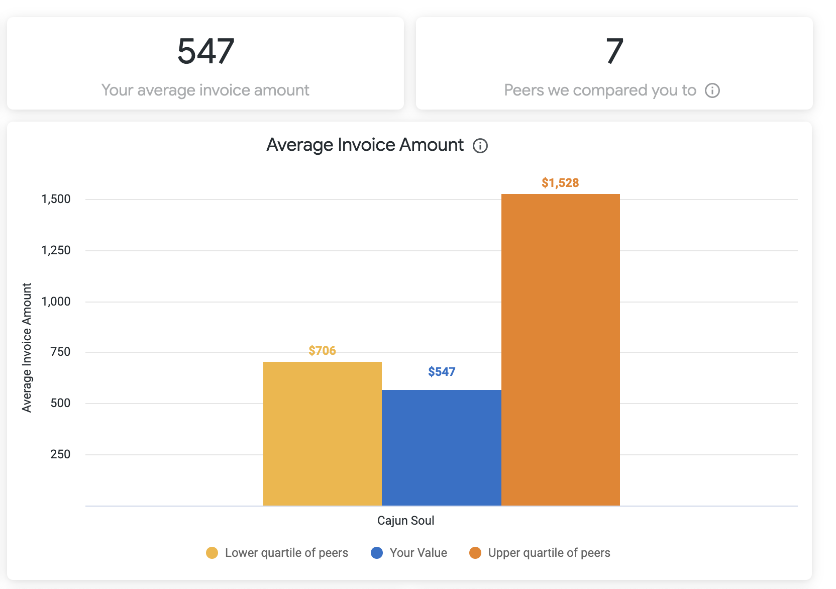
Average Invoice Amount

Shows how your average invoice amount compares to your peer group. Determine if you are regularly being charged too much overall.


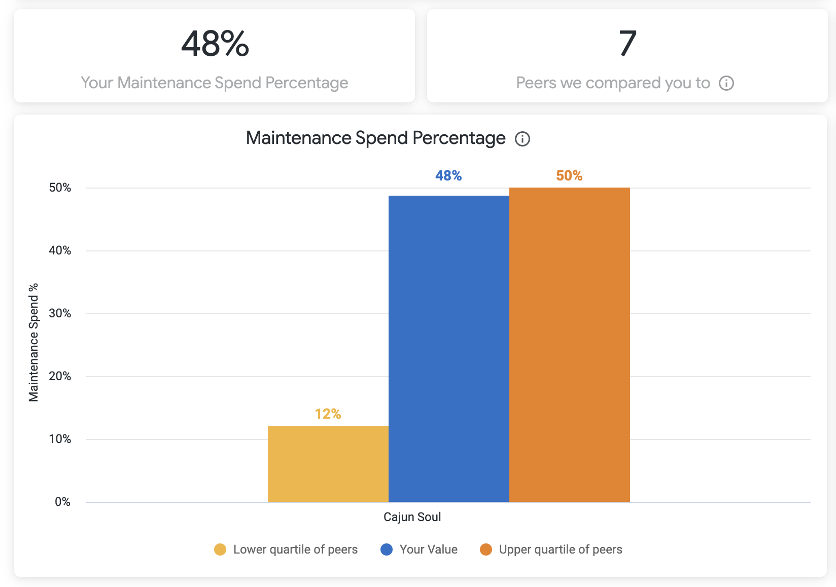
Maintenance Spend Percentage

Shows how your maintenance spend percentage compares to your peer group. Are you spending more than others on preventative maintenance? And does it match with predicted spend?


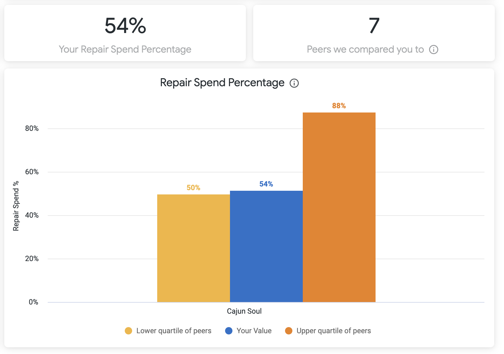
Repair Spend Percentage

Shows how your repair spend percentage compares to your peer group. 


Maintenance and Repair spend do not include CAPEX amounts.


Workorder Volume

Metrics used in this section are based off the call date from the last rolling 12 months.


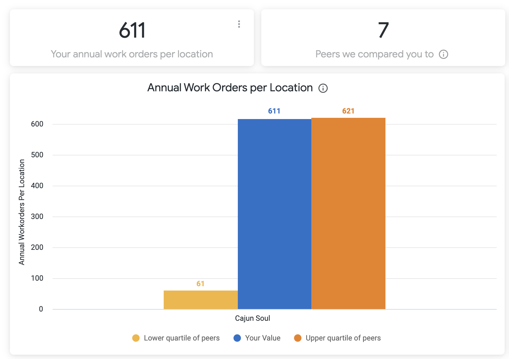
Annual Work Orders per Location

Shows how your annual work orders per location compares to your peer group and is based on the invoice posted date from the last rolling 12 months. Easily check the ratio between the amount of work orders vs the spend amount. Do you have a lot of spend, but not a lot of work orders? Here is a chance to tackle that with real data!


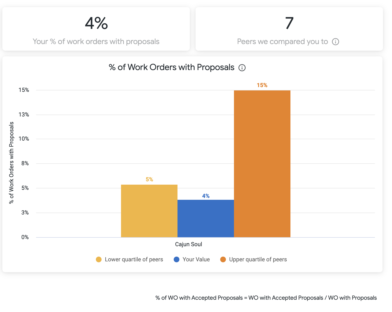
Percent of Work Orders with Accepted Proposals

Shows how your percent of work orders with accepted proposals compares to your peer group. If you have a high percentage, it might mean you don't have your NTE set at the right amount. If it's too low, you could be regularly overcharged due to too high of an NTE amount.


The accepted proposal percentage is calculated by dividing the number of repair work orders with proposals by the total number of repair work orders.


Efficiency

Time metrics used in this section are based off the call date from the last rolling 12 months.


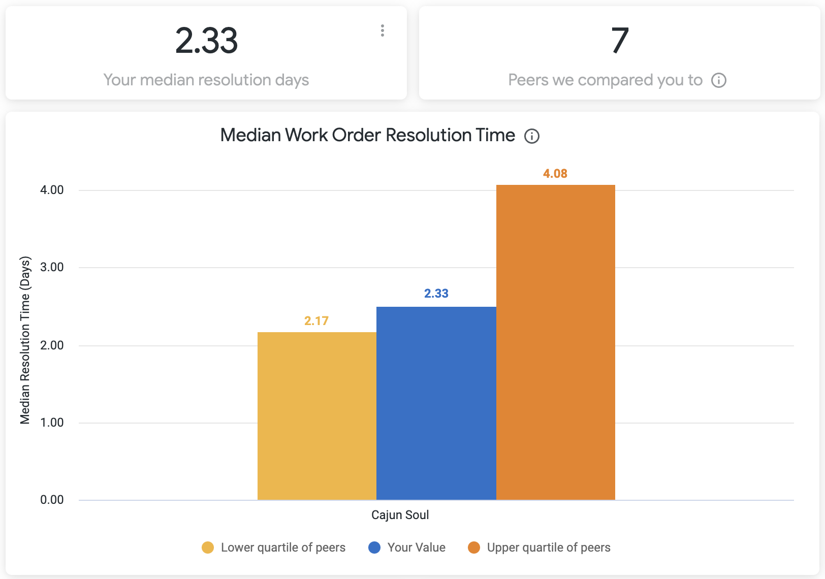
Median Work Order Resolution Time

Shows how your median resolution time in days  compares to your peer group. Ascertain how quickly your providers are completing work orders in comparison to other people's providers. This is one more way you can measure the efficiency of your providers!


Work order resolution time is calculated as the median minutes difference between the call date and completion date.


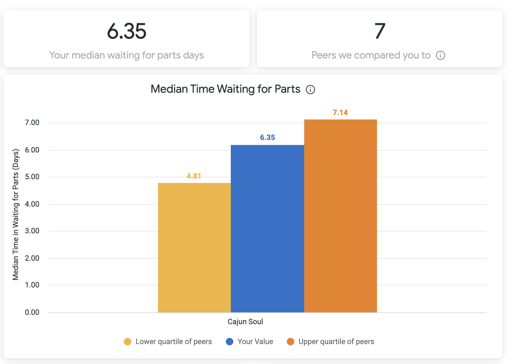
Median Time Waiting for Parts

Shows how your median time waiting for parts compares to your peer group. Work orders that actually move into the waiting for parts status are shown here. This is a way you can determine if the supplier your provider is using is as efficient as they can be now that you can compare them across the industry. If they aren't, here is a solid talking point for you and your provider.


Median waiting for parts time is calculated by the SUM of minutes difference from any PARTS related status to the next status.


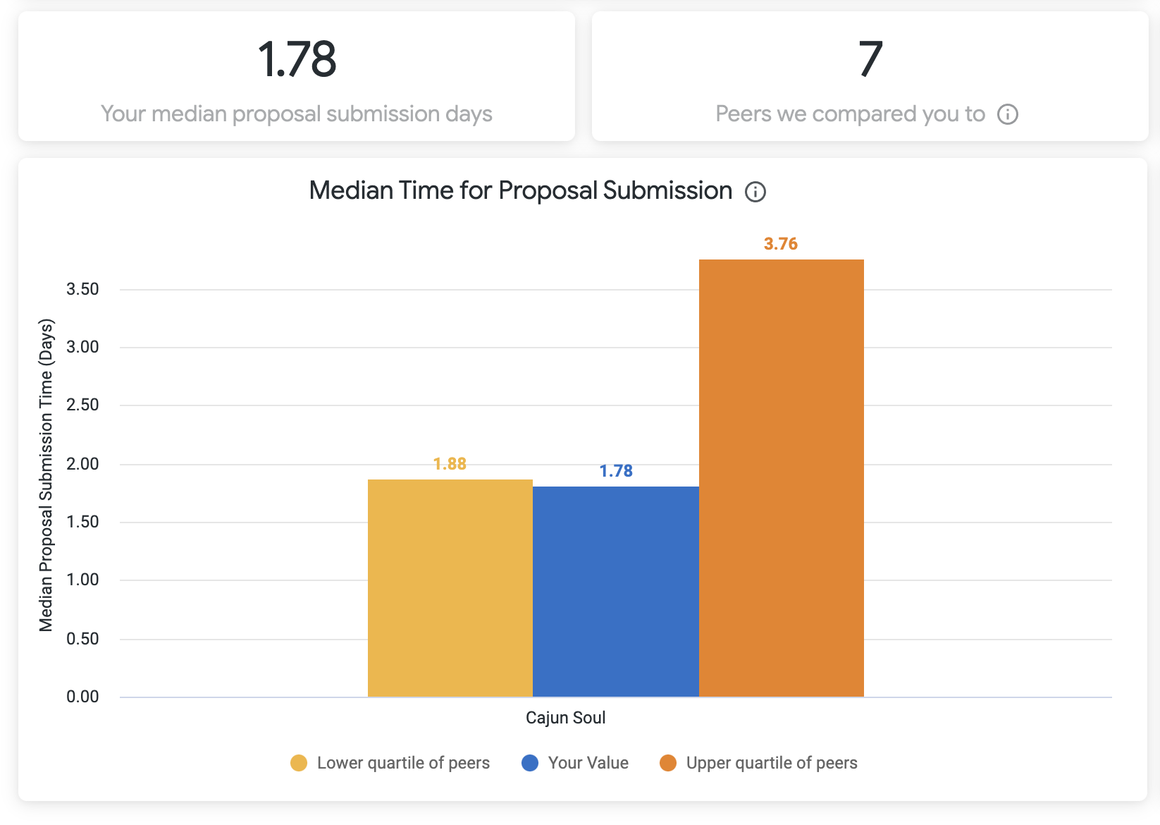
Median Time for Proposal Submission

Shows how your median proposal submission time (in days) compares to your peer group. See how responsive your providers are in getting proposals in and ultimately completing work orders faster.


Median proposal submission time is calculated by the difference between WAITING FOR QUOTE and WAITING FOR APPROVAL status.


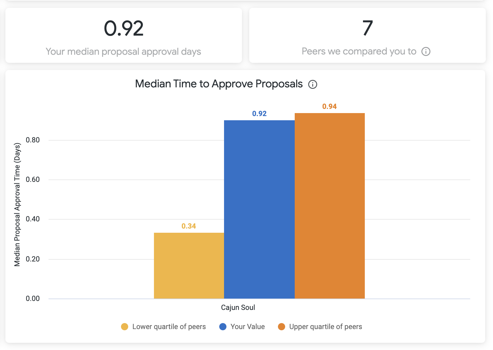
Median Time to Approve Proposals

Shows how your median proposal approval time (in days) in the top 4 primary trades compares to your peer group. Here you can measure how fast your facility management team is approving proposals. If it isn't as fast as your peers, you have an opportunity here to address this speed bump in the Work Order Lifecycle with your team.


Median proposal approval time is calculated by the difference between WAITING FOR APPROVAL and PROPOSAL APPROVED status.