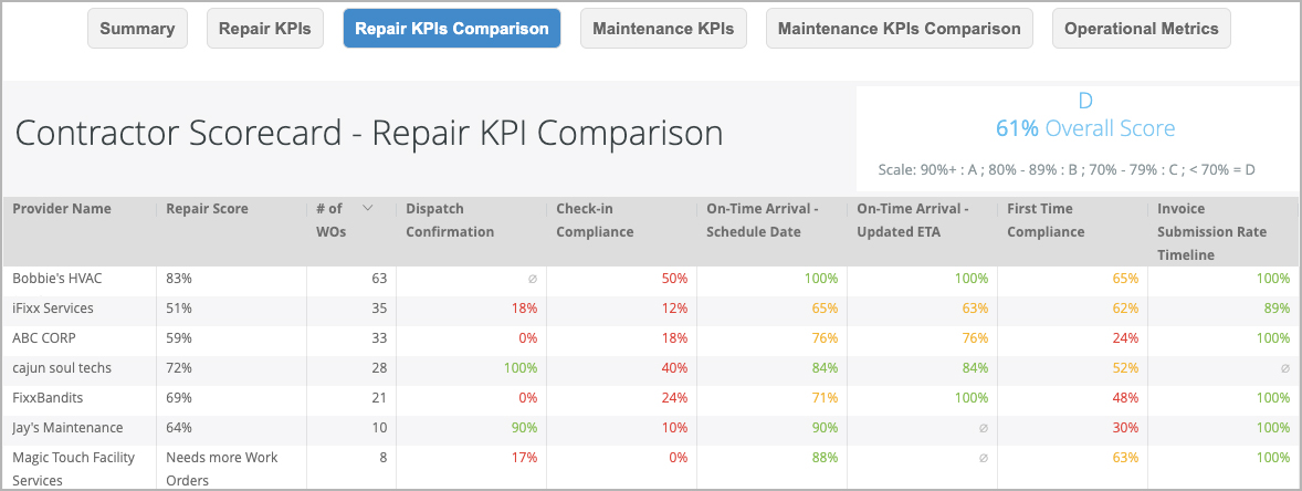
The Repair KPI Comparison visualization shows how your service providers stack against each other, according to both overall score and for each key performance indicator.
Seeing the data behind your providers' performance helps you determine which providers are complying with your workflow given the volume of work assigned to them. It helps you see whether your 'favorite' providers are great people but horrible at checking in or invoicing on time. This data helps you unearth 'star' providers in your network, or helps you see whether you need a conversation to help performance get better.
Comparison Data
Here you will see:
the list of service providers in your network that were assigned work orders,
- the repair KPI for each provider,
- the number of work orders assigned to that provider over the past 365 days (or during the filtered time frame),
- the percentages for each repair KPI, and
- the overall grade and score for your entire provider network (or for the service providers listed using the filter).
Under Repair Score, providers with less than 10 completed work orders in the past 12 months will show “Needs more work orders” instead of an overall score. Providers with no work orders during the selected date range are filtered out of this visualization. |

Drilling Down into the KPIs
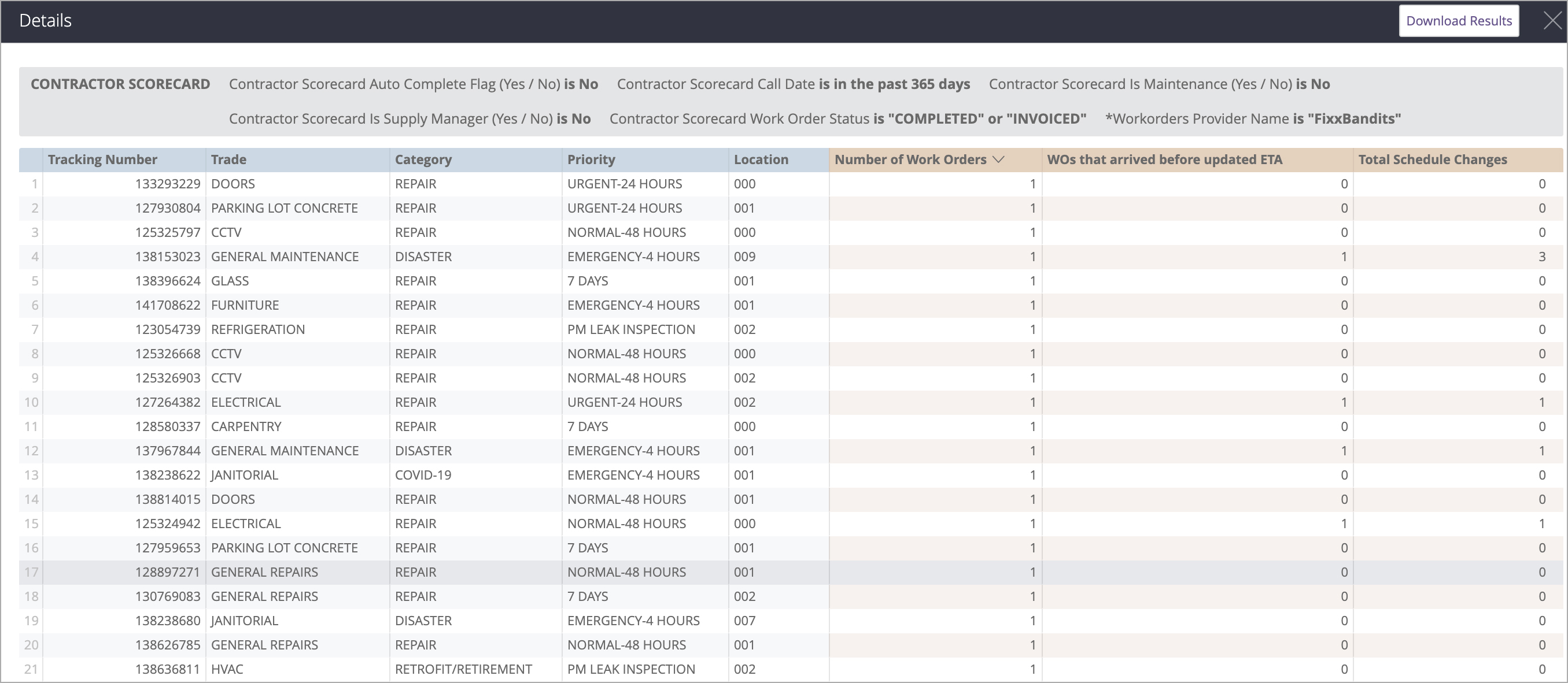
Clicking a KPI drills down into the data, showing the list of work orders and other relevant information about that KPI. Clicking a tracking number from here navigates you to the Work Order Details in Service Automation.
