- Created by Chellie Esters , last modified on Jun 06, 2020
You are viewing an old version of this page. View the current version.
Compare with Current View Page History
« Previous Version 21 Next »
The NTE Optimization Dashboard is designed to help you optimize the not-to-exceed amounts (or NTEs) configured to your trades. It also helps you understand the effectiveness of these NTEs from both an operational and a financial standpoint.
You can download the data and email reports to recipients.
NTE Optimization Sections
NTE Optimization accounts for all of the relevant trades used to compile the metrics. This report is comprised of 2 parts:

- Headline Metrics that visualize essential statistics to help you analyze your NTEs; and
- NTE Optimization data table that breaks down NTE amounts and percentages by Trade.
Here, you can see data from the past 365 days (by default) or by the criteria set in the all-inclusive filters along the top of the report.
NTE Headline Metrics
The key data in the headline metrics are as follows:

- % of Invoices within 95% of NTE: When analyzing this data, you want this percentage to be as high as possible. Should your invoice amounts be within 95%, you are operating your facilities in a comfortable range with respect to your NTE.
- % of Invoices where Invoice Amount = NTE: When an invoice amount equals an NTE amount, your facilities operations are within budget but are constrained because there is no room or margin.
- % of WO where NTE increased: You want to keep this metric as low as possible, as an increase in NTEs indicate that your company is not operating within your facilities budget, and thus have to spend more money than originally planned.
- % of WO where NTE changed: The difference between this percentage and the one regarding WO increasing represents the percentage of WOs who actually decrease the NTE. While this percentage as a whole includes WOs who increased the NTE, the difference is a positive percentage in that it signifies that certain WOs staying beneath the NTE and therefore saved your company money in other trades.
- Proposal to Work Order %: Denotes the proposals per WO ratio.
NTE Optimization Table
This report looks at each trade relevant to your facilities operations and looks deeper into various dollar amounts and percent changes in regards to NTE.

The following data is listed in the report, sortable by these column headers:
Trade: NTEs are configured by Trade. This helps you understand where you may be spending more money, or where you may be over/under your facilities budget.
Click the Trade to drill down into the list of associated work orders.
- Average Invoice Amount: Represent the average money spent per invoice for all invoiced WOs within a trade
- Original NTE: The original NTE, or maximum your company can spend, given to each trade
- Average NTE: The actual NTE amount (on average) that is calculated amongst all invoiced WOs
- % Time NTE Increase: How many of the total invoiced WOs exceeded the NTE amount per trade
- Inv. Amt. = Current NTE (%): The percentage of invoice amounts that were equal to that of the NTE
- Inv. Amt. within 95% of NTE (%): The percentage of invoices that lie within 95% of your NTE
- # of Work Orders: Total number of WOs completed within a trade
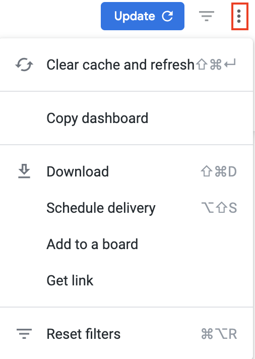
Below is a quick reference guide regarding tracking numbers in Analytics, filtering, sorting, downloading data, and sending reports. Throughout Analytics you can drill down into visualizations to see the underlying data. In most cases, the tracking numbers related to that data are listed. You can click the tracking number to navigate straight to the work order details in Service Automation. On top of the report are all-inclusive filters to help you hone in on key data. All reports on the page are affected by the criteria set in these all-inclusive filters. The filter criteria for each dashboard may differ. Filters reset to the default when the page is refreshed. Click filter field to show the criteria. Select the desired criteria to include or exclude: To Include criteria: select is equal to, contains, starts with, or ends with, and then begin typing the criteria in the picklist. Select the desired criteria (or multiple criteria) from the picklist. To exclude criteria: select is not equal to, does not contain, does not start with, or does not end with. Is null depicts the absence of data in a data set. Conversely, is not null depicts the presence of data To include or exclude data without a certain data criteria — for example, to select data without a Region or District assigned in Service Automation — choose is blank / is not blank. To add more options, click the plus sign (+) next to a field to add another option to the filter. The new option will appear as either an OR condition or an AND condition, depending on the type of filter option. Once all criteria are selected, click Refresh icon in the top-right corner. The Dashboard report updates with the selected criteria. More details are available on Filtering an Analytics Dashboard Analytics tables are dynamic, as you can: In the upper-right corner of any page, click the Vertical Ellipses to download reports, schedule delivery of reports at regular intervals, add to a board, or get a link. You can download data from a table and visualization or download a dashboard tabto PDF or CSV. Select the desired File Format and choose a File Name: A default name is listed but you can change it. On the desired dashboard (or dashboard tab), click the Gear icon in the upper-right of the page, and then click Download as PDF. The Download modal appears. A default Filename appears, but you can change it. Under Advanced options: Single-column format lays out all tables and visualizations on a page into one column in the PDF, as opposed to how it is laid out in the dashboard. Expand tables shows all rows in a table, instead of just the rows that appear on the dashboard. Paper size adjusts the PDF to your desired size. Click Open in Browser to view the PDF in your chosen browser, or click Download to save a version of the report onto your device. On the desired dashboard (or dashboard tab), click the Gear icon in the upper-right of the page, and then click Download as CSVs... A new browser tab opens. After the files render, you are prompted to save the CSV Zip file onto your device. More details are available on Downloading and Sending Dashboards and Reports You can also Send a one-time report via email or Schedule a recurring email send. On the desired dashboard (or dashboard tab), click the Gear icon in the upper-right of the page, and then click Send. The Send (Dashboard Name) modal opens. A Title is given by default, but you can change it. Under Who should it be emailed to?, enter the desired recipient(s), separated by a comma, and then click Add. (Optional) Click Include a custom message to add a personal note. Under Format data as, choose PDF, Visualization, or CSV Zip file. (Optional): Click Filters to limit the criteria that appear in the email. Note that the same filters on the dashboard itself will also appear here. Click Send. The email is sent to your recipients. On the desired dashboard (or dashboard tab), click the Gear icon in the upper-right of the page, and then click Schedule. The Schedule (Dashboard Name) modal opens. A Title is given by default, but you can change it. Under Who should it be emailed to?, enter the desired recipient(s), separated by a comma, and then click Add. (Optional) Click Include a custom message to add a personal note. Under Format data as, choose PDF, Visualization, or CSV Zip file. Under Deliver this schedule, choose Daily, Weekly, Monthly, Hourly, or By minute (in 5-minute increments, up to 30 minutes) (Optional): Use Filters to limit the criteria that appear in the email. Note that the same filters on the dashboard itself will also appear here. Click Send. The email is sent to your recipients. More details are available on Downloading and Sending Dashboards and ReportsCommonly Used Features
Tracking Numbers in Analytics
Filtering Dashboards
![]()
Dynamic Table Sorting

Downloading and Sending Reports


- No labels