The In the Operational Metrics tab allows comparison of various operational metrics through the life cycle of work orders. The data is available for work orders in the last 365 days.
The ability to compare metrics over different time periods provides a clear picture of service provider performance and whether it is trending in the right direction.
You may drill down each metric and view by month. For example, if the Average Resolution Time increased from one quarter to the next, you may drill down and notice that the Average resolution Time was actually higher in one month in the second quarter, which will help the service provider focus on what may have caused the increase in only that particular month.
Also, the ability to view related work order details for a desired metric makes it easy for clients and service providers to review each desired work order in detail.

Information is organized in two sections in the Operational Metrics tab:
- Filters, including the Compare Metrics selections.
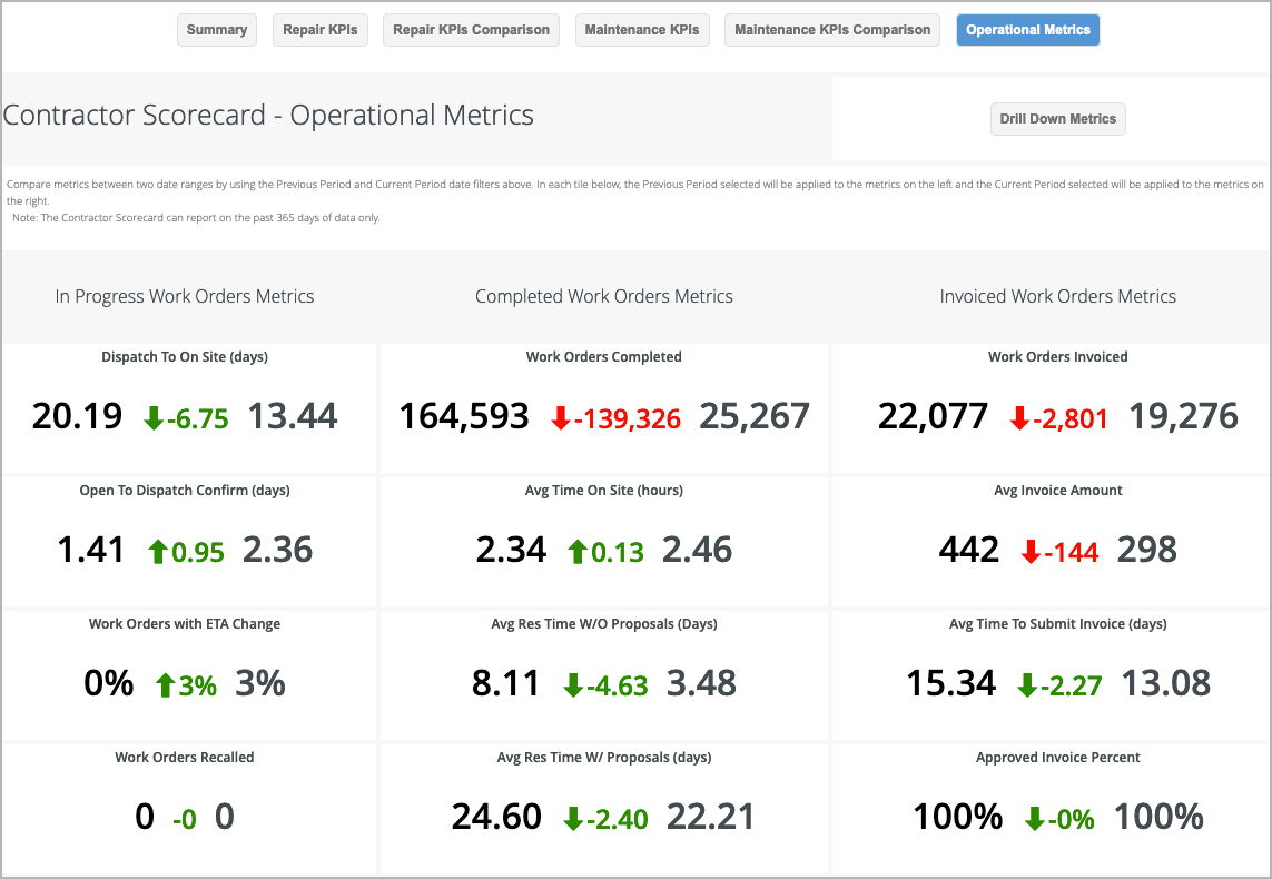
- Operational metrics organized by work order status: Open/In Progress Work Orders, Completed Work Orders, and Invoiced Work Orders.
You may view operational metrics for two date ranges in the past 365 days by selecting the desired date ranges in the From and To drop-down lists.
The values for the From date list in the left-side and the values for the To date range list in the right-section of each individual metric.
You will also notice whether there is a variation in a metric from one quarter to the next (or from any selected time period to the next):
- An upward pointing triangle indicates an increase and a downward pointing triangle indicates a decrease in the value for a metric.
- The triangles are color coded so as to easily identify improvement or decline in performance. Green indicates an improvement, and red indicates a decline for the metric.
- The actual increase or decrease displays below the red or green triangle.
Some examples are:
, you can compare metrics over two periods for Open/In Progress, Completed, and Invoiced work orders over the past 365 days (or a date range you specify). Reviewing data across all clients gives you an overall view of your operations; while reviewing these metrics for one client gives a clear picture of whether behaviors — such as average time on site or work orders recalled — are trending in the right direction with your client's expectations.
You can filter the date range to see the operational metrics for a specific time frame by using the Previous Period and Current Period filters.
| Note |
|---|
By default, the metrics illustrate data for all clients (Subscribers) within the past 365 days. Use the Subscriber filter in the all-inclusive filters along the top of the report to view by individual Clients, different date ranges, or other criteria, as needed. |
When comparing data, pay attention to the trend arrows.
- Metrics with green trend arrows illustrate a positive trend, whether upward or downward.
- For example, Dispatch to On Site trends positive as the comparison metric decreases, while Average Time On Site trends positive as the metrics increase.
- Metrics with red trend arrows illustrate a negative trend, also whether upward or downward.
- For example, Average Resolution Time with Proposal trends negative as numbers increase, while Average Invoice Amount trends negative as values decrease.
The following Operational Metrics are in this dashboard:
- Open/In Progress Work Order Metrics:
- Dispatch to On Site (days): The number of days between when a work order is dispatched and when your company arrives on site.
- Open to Dispatch Confirm (days): The number of days between when a work order is dispatched and when your provider company accepts the work order.
- Work Orders with ETA Change: The number of work orders where the scheduled date is updated.
- Work Orders Recalled: The number of work orders that are marked as Recall.
- Invoiced Work Order Metrics:
- Work Orders Invoiced: The number of work orders that have been invoiced.
- Avg Invoice Amount: This metric averages the monetary amount of all issued invoices.
- Avg Time to Submit Invoice (days): The average number of days that elapse between completing a work order (confirmed by the client as completed with Completed or Completed/Confirmed status) and the service provider submitting the invoice (invoice posted date).
- Approved Invoice Percent: The percentage of submitted invoices that are approved, indicating the accuracy of invoices.
- Avg Time To Approve Invoice (days): The time elapsed between invoice posted date and invoice approved date.
- Work Orders with NTE Changed: The number of work orders with a modified NTE.
- Completed Work Order Metrics
- Work Orders Completed: The total number of work orders completed.
- Avg Time On Site: The average time you or your technicians have spent on site to complete work orders.
- Avg Resolution Time Without Proposals (days): The average number of days that elapse from the work order creation date to the completion date for work orders that do not have proposals. Time on site is calculated as the time between the first check in and the last check out on a work order.
- Avg Resolution Time With Proposals (days): The average number of days that elapse from the work order creation date to the completion date for work orders with proposals.
- Avg Proposal Turnaround Time (days): The average number of days that elapse from when it was determined a work order required a proposal to the time your company submits the proposal to the client. It is calculated as the difference between the proposal date (when the proposal was available in Service Automation) and the date when the extended status of the work order was set to "waiting for quote."
- Avg Time to Approve Proposals: The average number of days that elapse between a client receiving a proposal (Proposal Date) and approving (Proposal Approval Date).
Drilling Down into Operational Metrics
By clicking on the name of each metric, you can drill down into each metric to view the related tracking numbers during the last completed month.
You can also click Drill Down at the top of the visualization to view metrics for Completed and Invoiced work orders. Here, you can view visualizations of average scores by day of the month and/or view related work order information. These visualizations help you quickly identify the trends for the metrics and when the performance was above or below the average.
Drilling down the value for a metric displays the list of work orders driven by that metric. Drilling down into the related visualization shows the data broken down by the day for the past 1 complete month.
| Anchor | ||||
|---|---|---|---|---|
|
| Insert excerpt | ||||||
|---|---|---|---|---|---|---|
|